Global online travel platform and part of Booking Holdings, operating across 40+ markets
My role: B2B product designer creating data-driven solutions for 1 million+ hotel and home partners
Worked with: 10+ scrum teams, 10+ product owners across multiple products
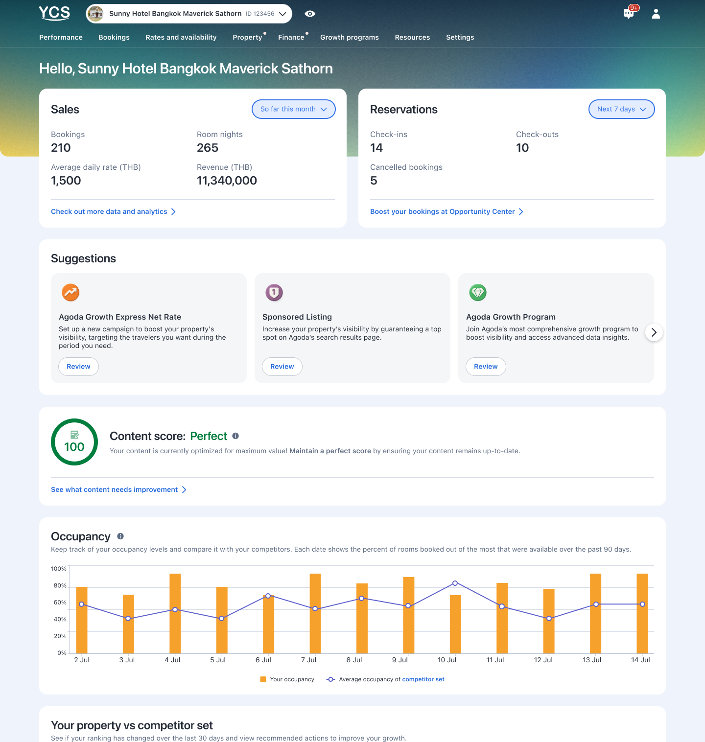
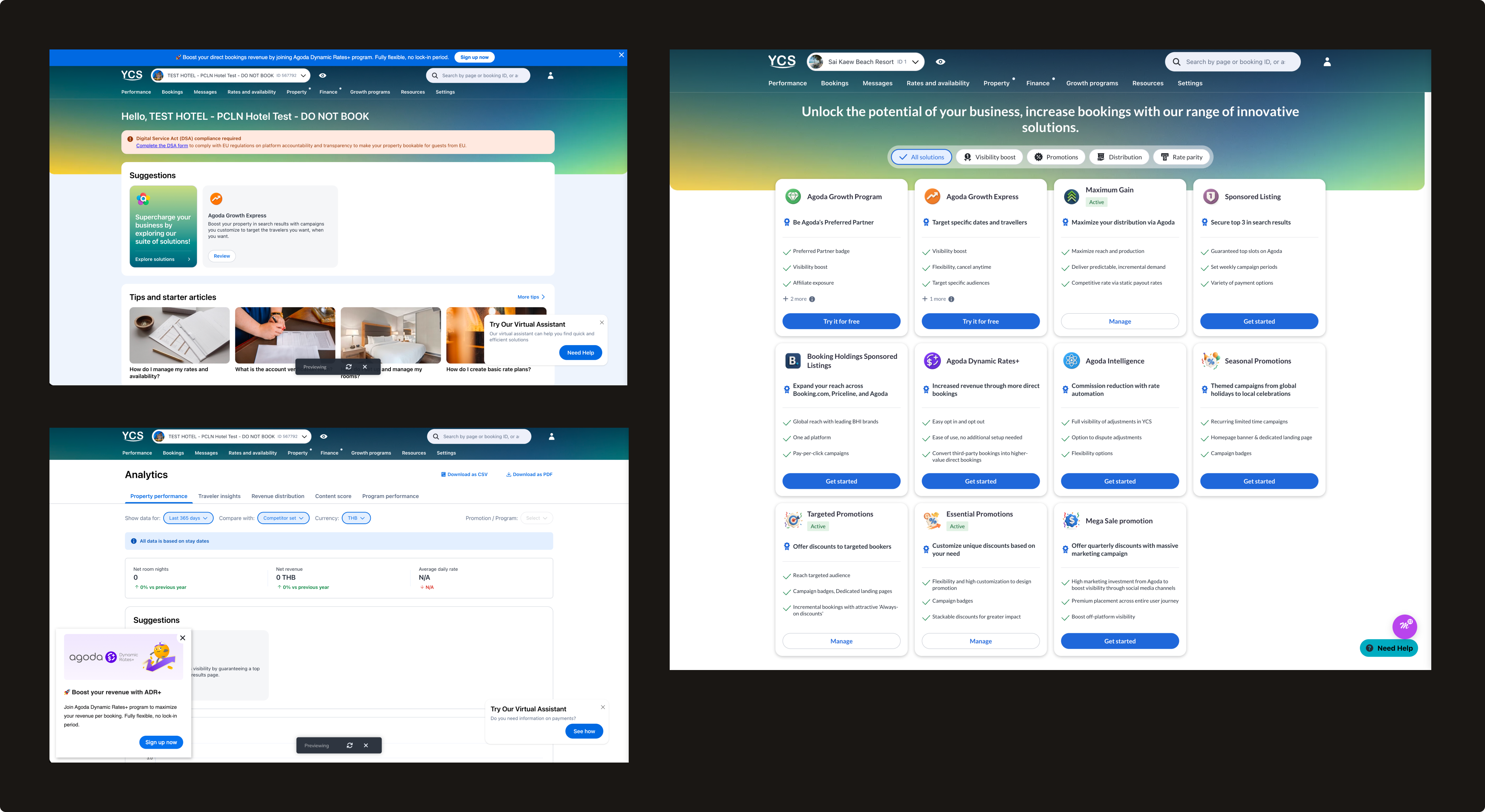
Agoda Partner Portal
Agoda's partner-facing platform where hotel and home partners manage their listings, rates, and performance.
Features I shipped: Analytics, Partner programs, Calendar, Finance, and more
Supported devices: Desktop, Tablet, Mobile
Analytics Center
How I bring AI into my design process
Product: Agoda Partner Portal's Analytics Center, revamped across two parallel product milestones — Market Demand and Margin Program performance reporting.
My work:
Sole designer across both milestones, working with 2 scrums and 2 product managers
Built a shared AI workflow in Cursor — from context-gathering to prototyping to sync-note automation — that shaped both revamps
Product: An automated pricing program on Agoda Partner Portal that helps hotels beat third-party listings by 2% to convert more direct bookings and increase revenue, now serving over 15K active hotels and growing.
My work:
Full product ownership from pre-activation sign-up through post-activation management and analytics
Created 8+ core features including self-sign-up, tier selection, program dashboard, performance report, and deactivation flow
How I turn scattered feedback into a single source of truth
Product: An AI-powered dashboard that transforms thousands of quarterly survey responses from Agoda's accommodation partners into an always-on, real-time source of truth — replacing a manual process that ran only once a year. Now used across Supply, Product, Partner Experience, and business teams.
My work:
Initiated and led project from concept to launch
Designed a standardized 53-tag taxonomy and dashboard interface
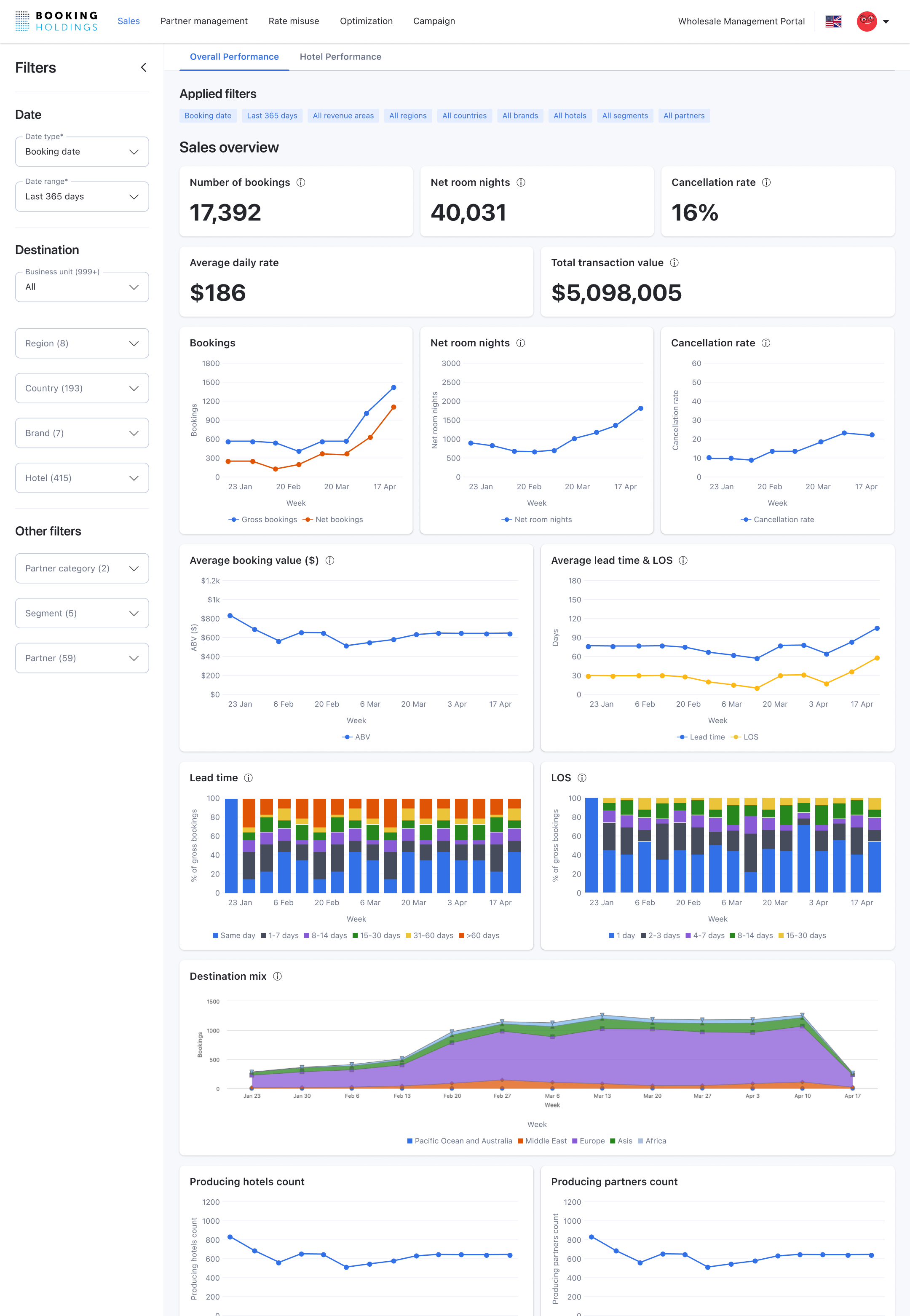
Product: B2B rate distribution platform developed by Agoda for Booking Holdings that helps hotel and chain partners optimize B2B rate distribution and prevent revenue leakage across multiple booking channels.
My work:
Designed end-to-end experiences for hotel partners and backoffice agents
Built 5 core features including sales overview, partner management, rate misuse detection, optimization tools, and campaign management
⏳ Coming soon
Muang Thai Life Assurance
2022 – 2023
One of Thailand's largest life insurance companies
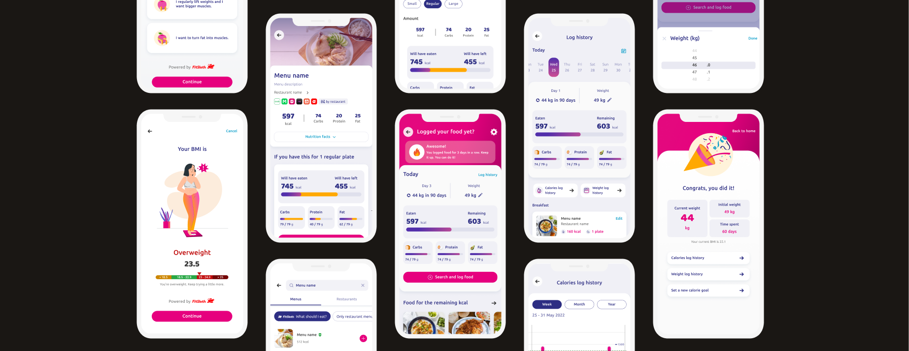
MTL Fit Health App
How I start my career as a sole designer
Product: B2C health and wellness app for Muang Thai Life Assurance's policyholders
My work:
Sole B2C product designer in an agile development team
Later promoted to Lead UX/UI Designer — led a junior designer through a full app redesign, covering architecture planning, product roadmap, and a new design system
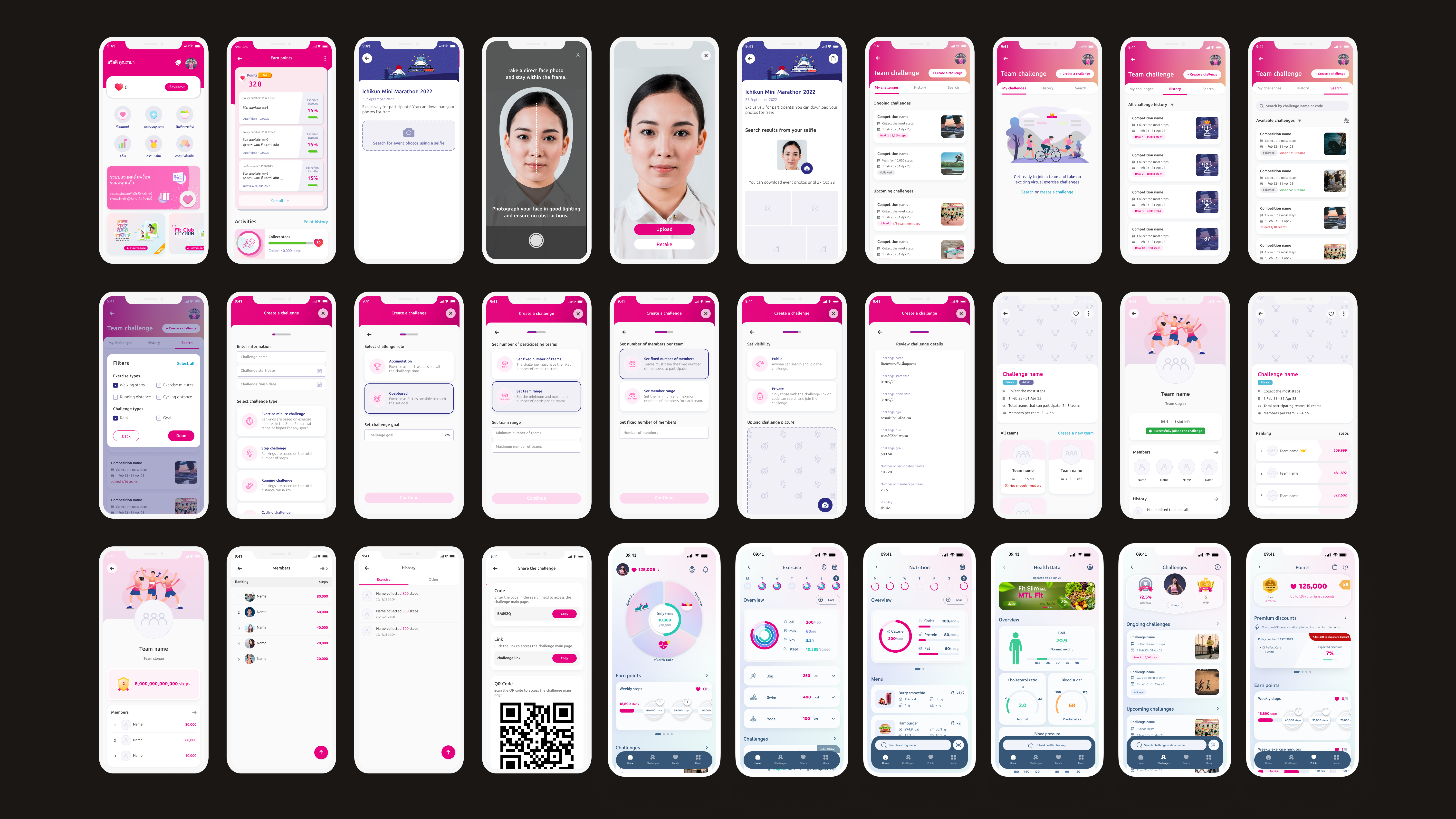
Built features including dynamic pricing, nutrition tracking, team challenges, photo download, and back office tools
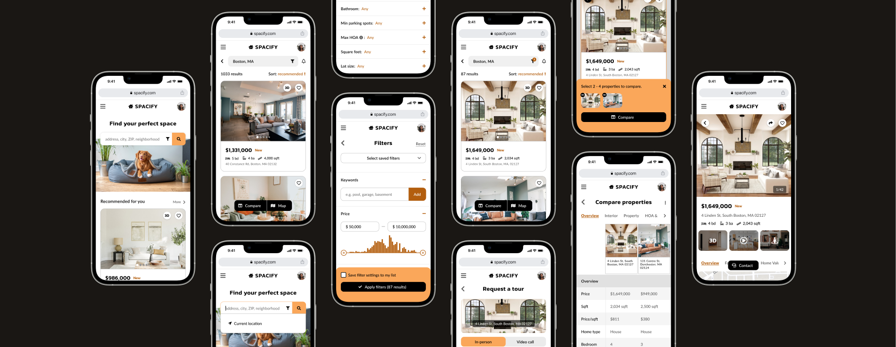
Product: A 6-week intensive course project — a responsive web app that provides property buyers with information on properties of interest.
My work:
Mapped user flows for property search journeys and built wireframes through high-fidelity prototypes
Created a complete visual design system and responsive layouts across mobile, tablet, and desktop
⏳ Coming soon
Agoda · 2024 – Present
B2B product designer creating data-driven solutions for 1 million+ hotel and home partners
Agoda Dynamic Rates+
An automated pricing program on Agoda Partner Portal that helps hotels beat third-party listings by 2% to convert more direct bookings and increase revenue, now serving over 15K active hotels and growing.
Full product ownership from pre-activation sign-up through post-activation management and analytics
Created 8+ core features including self-sign-up, tier selection, program dashboard, performance report, and deactivation flow
Agoda's partner-facing platform where hotel and home partners manage their listings, rates, and performance.
Calendar Sync — Designed calendar synchronization feature for home properties to manage availability across multiple booking platforms like Airbnb and Booking.com
Chargeback Notification — Designed chargeback alert feature that notifies properties and supports dispute management
Agoda Advanced — Designed self-sign-up page and transaction details page for this partner program
Partner Programs — Contributed to strategic vision for consistent program education and experiences across all partner programs
Finance — Supported Finance UI redesign by consolidating user research and partner satisfaction data
An AI-powered dashboard that transforms thousands of quarterly survey responses from Agoda's accommodation partners into an always-on, real-time source of truth — replacing a manual process that ran only once a year.
Initiated and led project from concept to launch
Designed a standardized 53-tag taxonomy and dashboard interface
Now used across Supply, Product, Partner Experience, and business teams
Wholesale distribution platform developed by Agoda for Booking Holdings that helps hotel and chain partners optimize B2B rate distribution and prevent revenue leakage across multiple booking channels.
Designed end-to-end experiences for hotel partners and backoffice agents
Built 5 core features including sales overview, partner management, rate misuse detection, optimization tools, and campaign management
A $7.5M automated pricing program that helps 15,000+ hotel partners beat third-party listings by 2% to convert more direct bookings and increase revenue.
As the sole designer from launch to scale, I owned every stage of the program and every touchpoint of the hotel partner journey — from pre-activation education and sign-up through post-activation management and analytics. I created 8+ core features, built scalable design systems that supported future growth while features were still being defined, conducted SQL data analysis to identify business and design opportunities, and advocated for strategic initiatives backed by data insights.
I structured my design approach across three phases, each responding to a new set of challenges as the program and its hotel partners evolved.
Phase
Product lifecycle
Partner need
Phase 1
Launch
Discover — Should I join the program?
Phase 2
Grow
Commit — Is this worth staying in?
Phase 3
Scale
Succeed — How do I get the most out of this?
Phase 1 · Launch
Discover — Should I join the program?
Problem
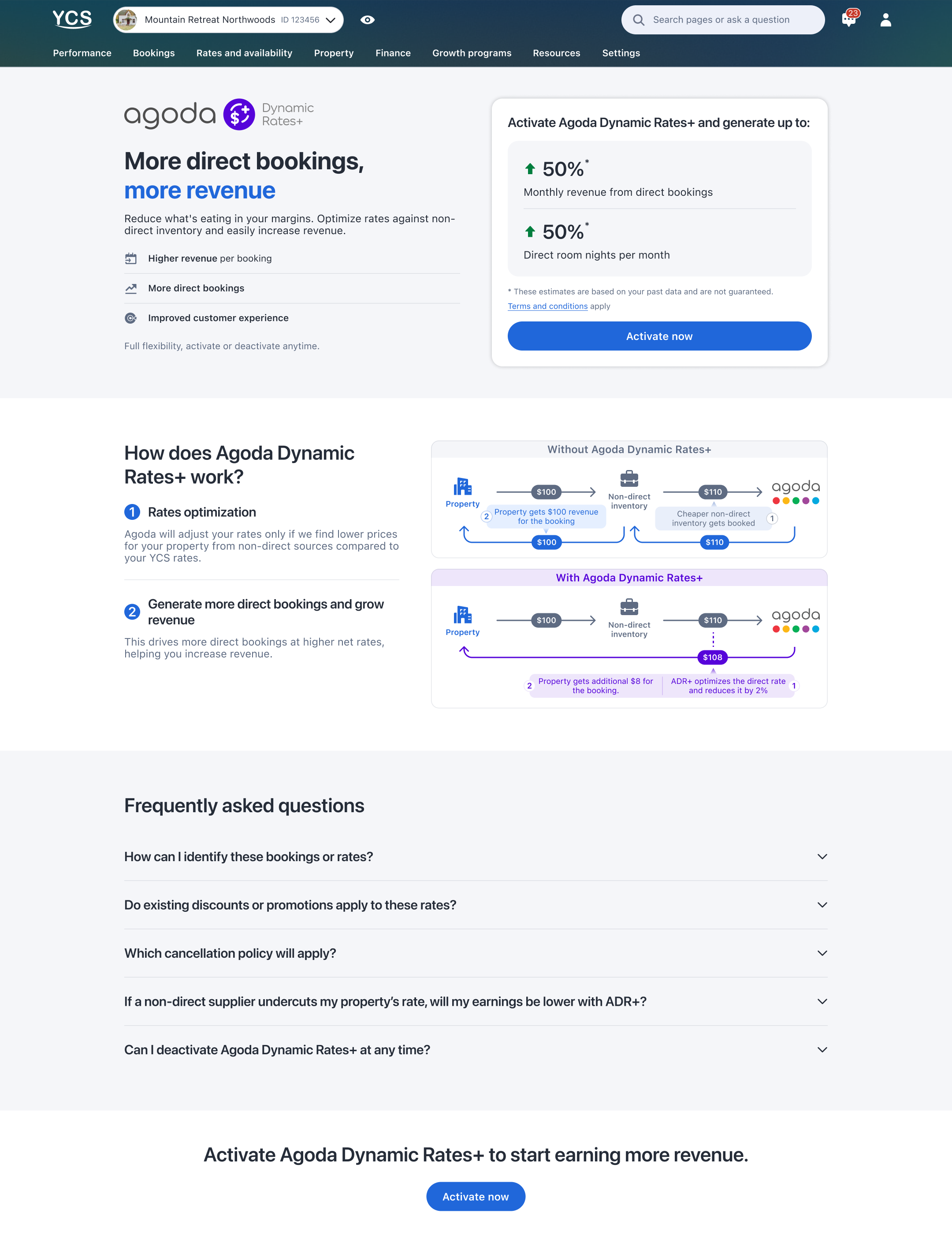
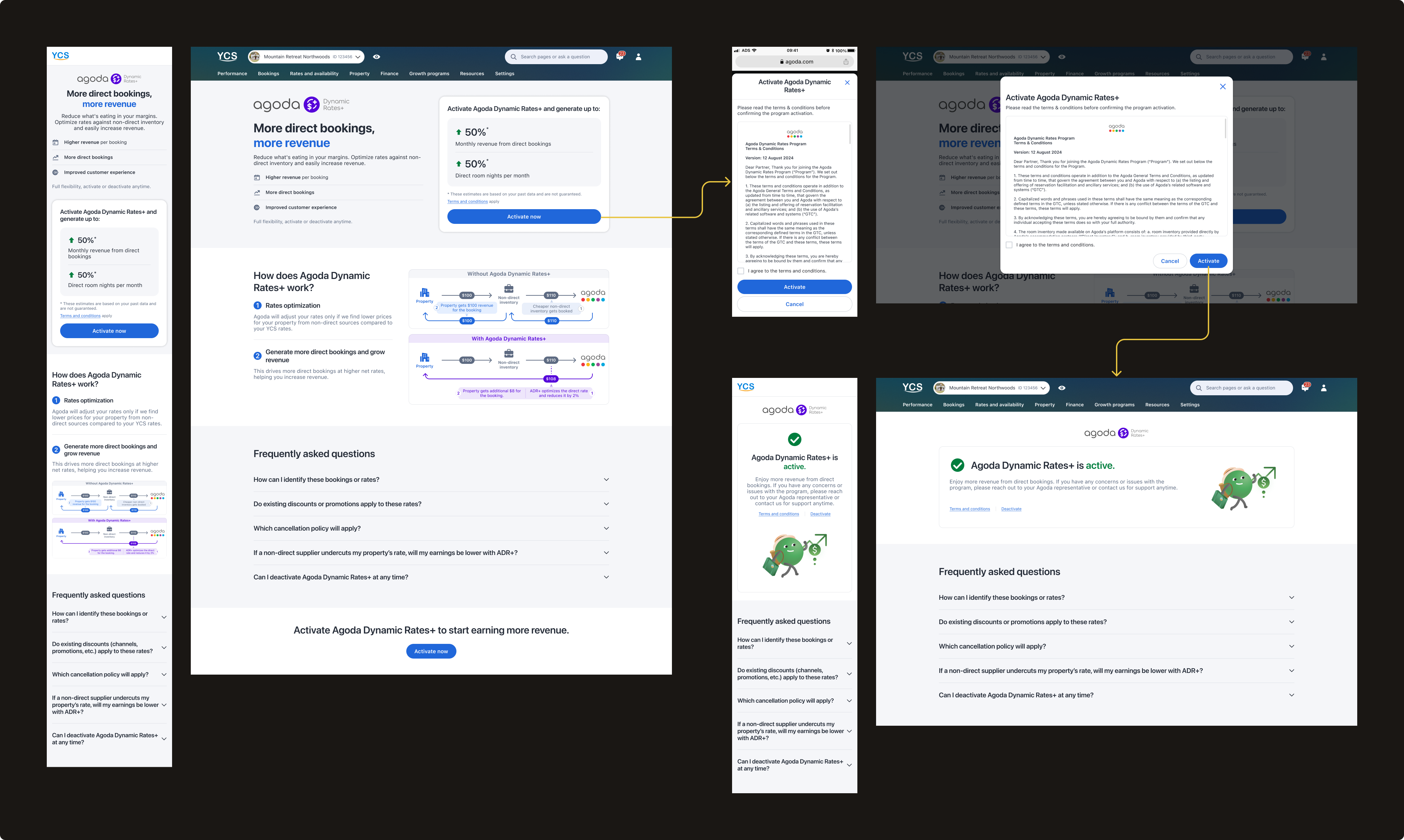
When we launched ADR+ on Agoda Partner Portal in June 2025, we started with only a self-sign-up flow and a minimal landing page — the goal was to validate hotel adoption before investing further. I broke down the design challenge into three core questions:
How do I drive the 35,000–40,000 eligible hotels visiting Agoda Partner Portal every month to discover ADR+?
How do I explain a complex automated pricing program clearly enough that hotels feel confident and want to join?
How do I make the sign-up experience as easy as possible?
Ideate & Iterate
For discoverability, I explored three touchpoints to reach hotels:
→
Banner & slideout — I investigated high-traffic pages within Agoda Partner Portal and placed a banner and slideout where hotels were most likely to see them. This approach had shown promising results in past campaigns and could be self-published via a third-party tool with minimal dev effort, making it fast to test and iterate
→
ADR+ card on Growth Programs page — once a consolidated partner program hub launched after ADR+, I leveraged it to surface ADR+ alongside other programs hotels were already actively browsing
→
Email — evaluated but deprioritized due to typically low click-through rates and higher dev effort compared to the other channels
For education, I worked with the business team to align on the core narrative: lead with revenue impact, make it tangible with personalized estimates based on each hotel's own data, and explain the pricing mechanic through a side-by-side visual diagram rather than text. I ran quick internal testing to validate which explanation was clearest, and anticipated top hotel concerns in a proactive FAQ organized by user intent.
For sign-up, I worked with the PM and legal team to define the absolute minimum requirements — landing on a single confirmation step with just T&Cs and one click to confirm. I also added a self-deactivation button upfront so accidental clicks could be undone without friction, maintaining partner trust in the program's flexibility.
Outcome
4,500–6,000
Unique hotel page visits per month sustained across 10 months post-launch
5%
Page-to-activation conversion rate — lower than initially expected, reflecting the complexity of the program
Hotels often consulted their account managers before committing, suggesting that for a program of this nature, the conversion journey extends beyond the page itself.
88%
Completion rate from intent to activation — once hotels decided to join, the single-step confirmation eliminated drop-off almost entirely
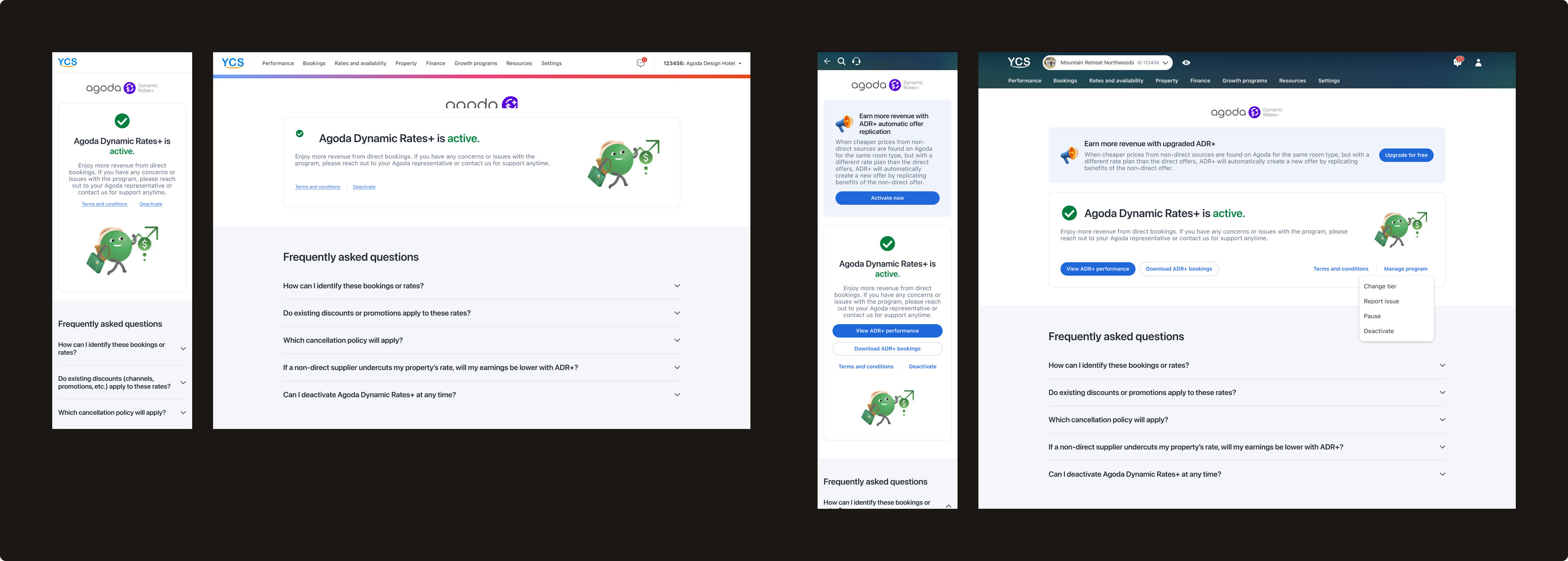
Phase 2 · Grow
Commit — Is this worth staying in?
Problem
Six months after launch, ADR+ had scaled significantly — but we were seeing a ~10% churn rate. The MVP experience we launched with was no longer sufficient. To understand why hotels were leaving, I leveraged two data sources I had previously set up: tracking across all features, and 2,500+ responses from the MVP deactivation survey.
Research & Analysis
Using SQL to query deactivation patterns by hotel segment, booking volume, and time in program, I surfaced 4 key insights:
Insight 01
Low ADR+ dashboard engagement
Gap between portal visits vs ADR+ page widened over time — minimal value for return visits.
Surface key info on dashboard for immediate value
Insight 02
Deactivation by booking volume
77% of deactivations among hotels with 0–50 ADR+ bookings — ~8% also new to Agoda overall, pointing to an onboarding gap.
Help hotels understand value without large booking volumes
Insight 03
Deactivation timing
28% deactivated within 1 week, 50% within one month.
Provide early engagement touchpoints
Insight 04
Top deactivation concerns
Low net rates, no bookings, not understanding benefits, rate parity concerns — from 2,500+ survey responses.
Surface relevant alternatives before deactivation
From these insights, I defined two clear design objectives:
🎯 Enhance post-activation experiences
Give hotels more visibility into program performance, increase engagement, and reduce churn.
🎯 Ensure scalability
Design the dashboard to accommodate continuous feature additions without creating clutter. As features multiplied, buttons and links were competing for attention and creating information hierarchy issues.
Dashboard redesign
Before
After
1Program title & tagline
Designed as a reusable pattern for scalability — other partner programs can adopt this consistent structure.
2Action hierarchy
Frequently used actions → displayed as main buttons upfront
Optional, less frequent actions → nested under "More"
Maintains clear CTA hierarchy and discoverability while accommodating future actions without overwhelming the interface.
3Program details
Status (Active, Trial, or Paused), Tier level, and date context. Key improvement for trial users: clearly stating "Trial" status and showing the trial end date upfront encourages new hotels to give the program a fair chance even before seeing immediate results.
4Performance metrics
4 key metrics surfaced directly on the dashboard rather than requiring navigation to a separate analytics page — giving hotels immediate visibility to evaluate program value and make informed decisions.
5"Get more value" cards
A modular card system for high-priority personalized suggestions — flexible enough to scale as new features are added, while keeping static content like FAQ at a lower hierarchy level.
6FAQ
Reorganized by user intent:
"How can I optimize ADR+ performance?" — addresses top concerns from deactivation survey responses
"How does ADR+ work?" — provides educational content to clarify program mechanics
After validating technical feasibility with the lead engineer, I presented the redesign to the PM with quantified business impact. The PM agreed and committed to the long-term 2026 roadmap. However, he raised concerns about Q1 development effort since the revamped dashboard wasn't in his original Q1 milestones. I addressed this by proposing an MVP version for Q1 that would lay the foundation with minimal development effort while accommodating planned Q1 features — with the complete version following in subsequent quarters. This phased approach balanced immediate business needs with long-term strategic goals.
The redesign will be measured by: retained active users, reduced deactivation rate, decreased support escalations, and increased page engagement.
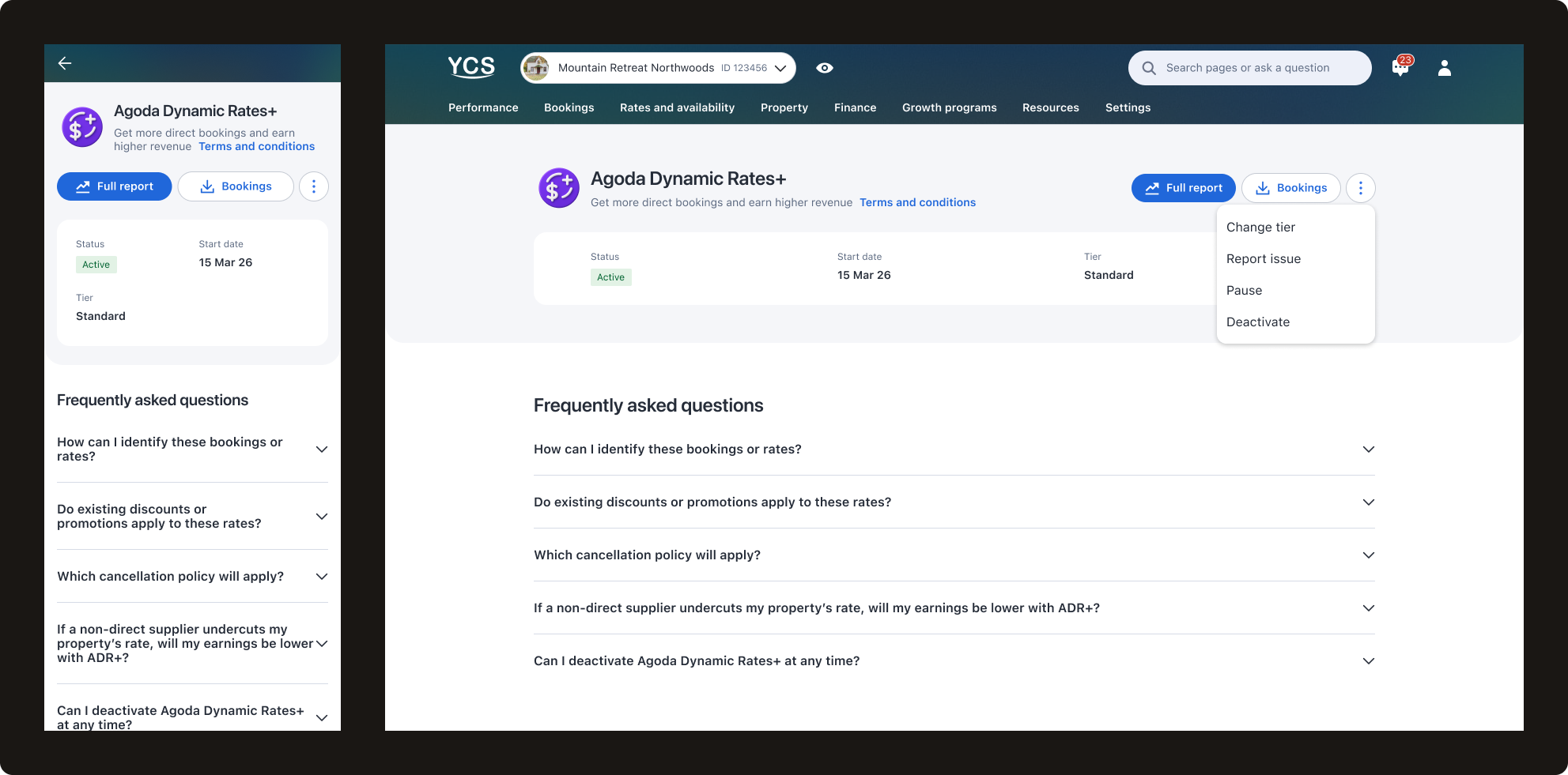
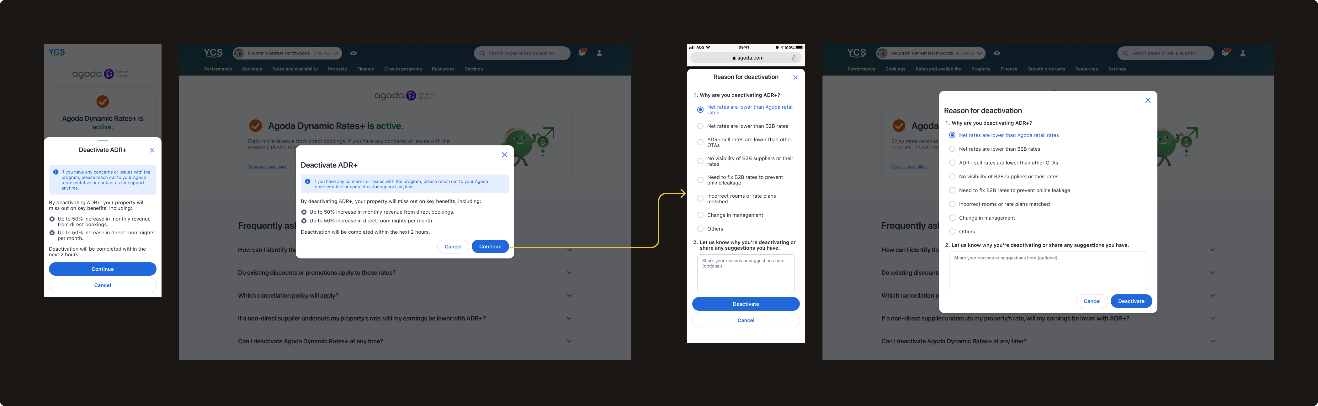
Enhanced deactivation flow
The enhanced flow turns a deactivation intent into a retention and support opportunity — with personalization, alternatives, and better data collection at every step.
→
Personalized first step — two versions based on hotel data: no ADR+ bookings variant encourages staying enrolled for future benefits; bookings variant shows full key metrics summary (average daily rate, net revenue, net bookings, net room nights vs. non-direct bookings) — making the cost of leaving concrete and personal
→
Alternative options step — Change tier (recommended), Pause, Report issue, or Proceed with deactivation — surfacing options hotels may not have known existed
→
Report issue flow — dedicated path to flag specific problems with preferred contact method, turning deactivation intent into a support opportunity
→
Enhanced deactivation survey — refined from v1 learnings, with clearer reason categories and document upload for more actionable data
v.1 — MVP flow
v.2 — Enhanced flow
Outcome
The enhanced deactivation flow launched in March 2026. Early data shows an encouraging downward trend — deactivation rate dropped from 8.7% in February to 5.12% in March and 4.26% in April, reaching one of the lowest rates since program launch.
8.7%
Deactivation rate in February 2026
5.12%
Deactivation rate in March 2026
4.26%
Deactivation rate in April 2026 — one of the lowest since launch
While it is still early to draw definitive conclusions, the initial signal is positive and we will continue monitoring over the coming months.
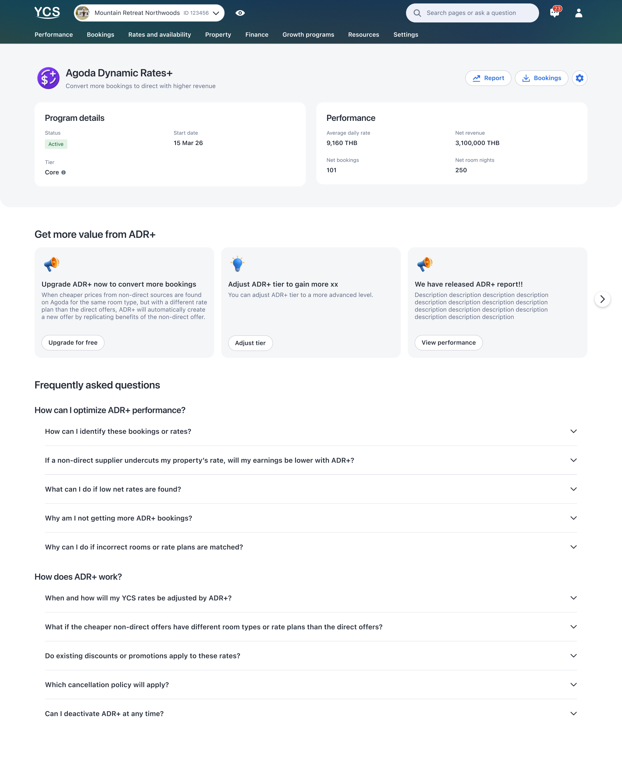
Phase 3 · Scale
Succeed — How do I get the most out of this program?
Problem
With activation and retention addressed, we now focus more on maximizing value for hotels that stayed — and revenue for Agoda. Giving committed hotels the visibility and control to optimize their participation was always part of the vision; with the foundation in place, we could invest in it fully.
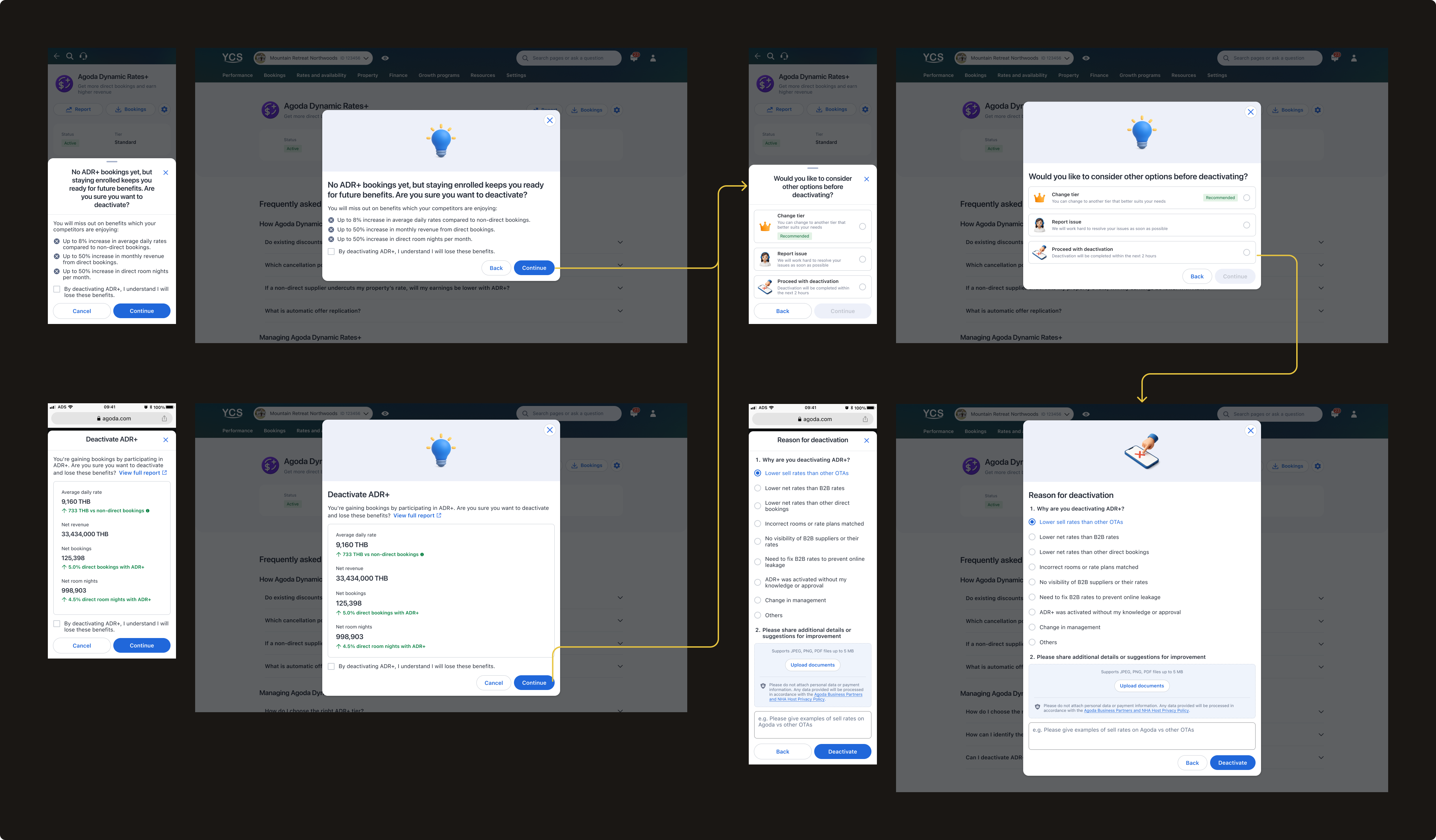
Working closely with the business team and PM, we expanded the program to maximize value and revenue by improving the program mechanism, providing more visibility, flexibility, and control to our partners. I designed the following key features:
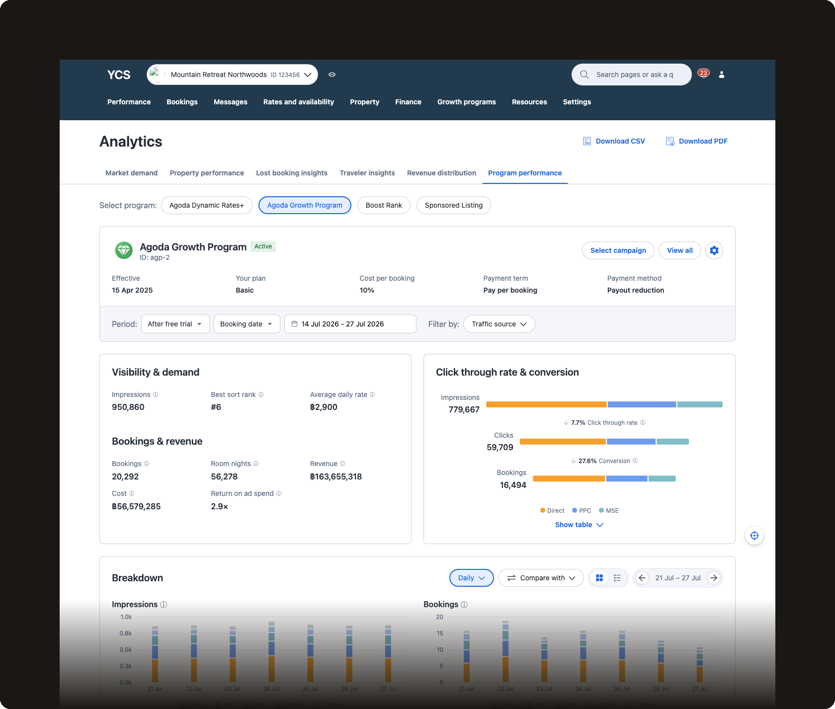
Program performance & bookings report
Dedicated performance and bookings reports giving hotels visibility into ADR+ booking volume, average daily rate vs. non-direct bookings, net revenue, and room nights — concrete data to evaluate and trust the program.
Tier selection
As the business team improved program logic to win more bookings against third-party listings, I introduced 4 tiers ranging from basic to advanced rate adjustment — giving hotels agency over how aggressively ADR+ operates for their property.
Pause
A flexibility option allowing hotels to temporarily halt ADR+ adjustments for a set bookable period — an alternative to deactivation for hotels needing to resolve pending issues.
Blackout dates (upcoming)
Allow hotels to block ADR+ adjustments on specific dates with more flexible control — giving partners greater precision over when the program operates.
Outcome
The program grew from 1,570 active hotels at launch in June 2025 to 16,460 in April 2026 — a consistent month-over-month growth across 10 months — generating $7.5M in revenue. This reflects the compounding impact of activation, retention, and ongoing program optimization working together across the full partner journey.
16,460
Active hotels in April 2026, up from 1,570 at launch
$7.5M
Revenue generated across the full program lifecycle
As the sole designer across the full program lifecycle, this case study reflects the breadth of my product design practice — from setting up tracking infrastructure and conducting SQL churn analysis, to translating a complex pricing mechanism into a complete program experience and shaping the long-term roadmap. ADR+ is the project I'm most proud of — not just for what it delivered, but for how it pushed me to grow as a designer who thinks beyond the screen.
B2C product designer building health tracking & property search experiences
Muang Thai Life Assurance · 2022–2023
MTL Fit Health App
Sole UX/UI designer in an agile development team, owning the health and wellness app for Muang Thai Life Assurance, one of Thailand's largest insurance companies. Later evolved to Lead UX/UI Designer for a comprehensive app redesign—leading a junior designer through full app architecture planning, product roadmap development, and new design system creation.
Balanced business objectives (user acquisition, engagement), user needs, technical efforts, and legal considerations through stakeholder collaboration, competitive analysis, and in-depth interviews with target users
End-to-end execution
From low-fidelity wireflows through high-fidelity mockups and development hand-off, maintaining design quality throughout fast-paced sprints. Led development of a new design system for the app redesign
User validation
Conducted moderated usability tests at key milestones, iterating based on real user feedback
Cross-functional collaboration
Maintained close communication with PM, business, development, and legal teams, shaping design directions and ensuring seamless implementation
What this experience taught me
Taking full design ownership and being the voice of the user in an agile, fast-paced environment
Balancing multiple stakeholder needs while maintaining design quality
Working efficiently with developers and PMs in sprint-based workflows
Making design decisions with limited data — which later drove me to learn SQL and data analysis at Agoda
Leading and mentoring a junior designer while driving strategic design vision
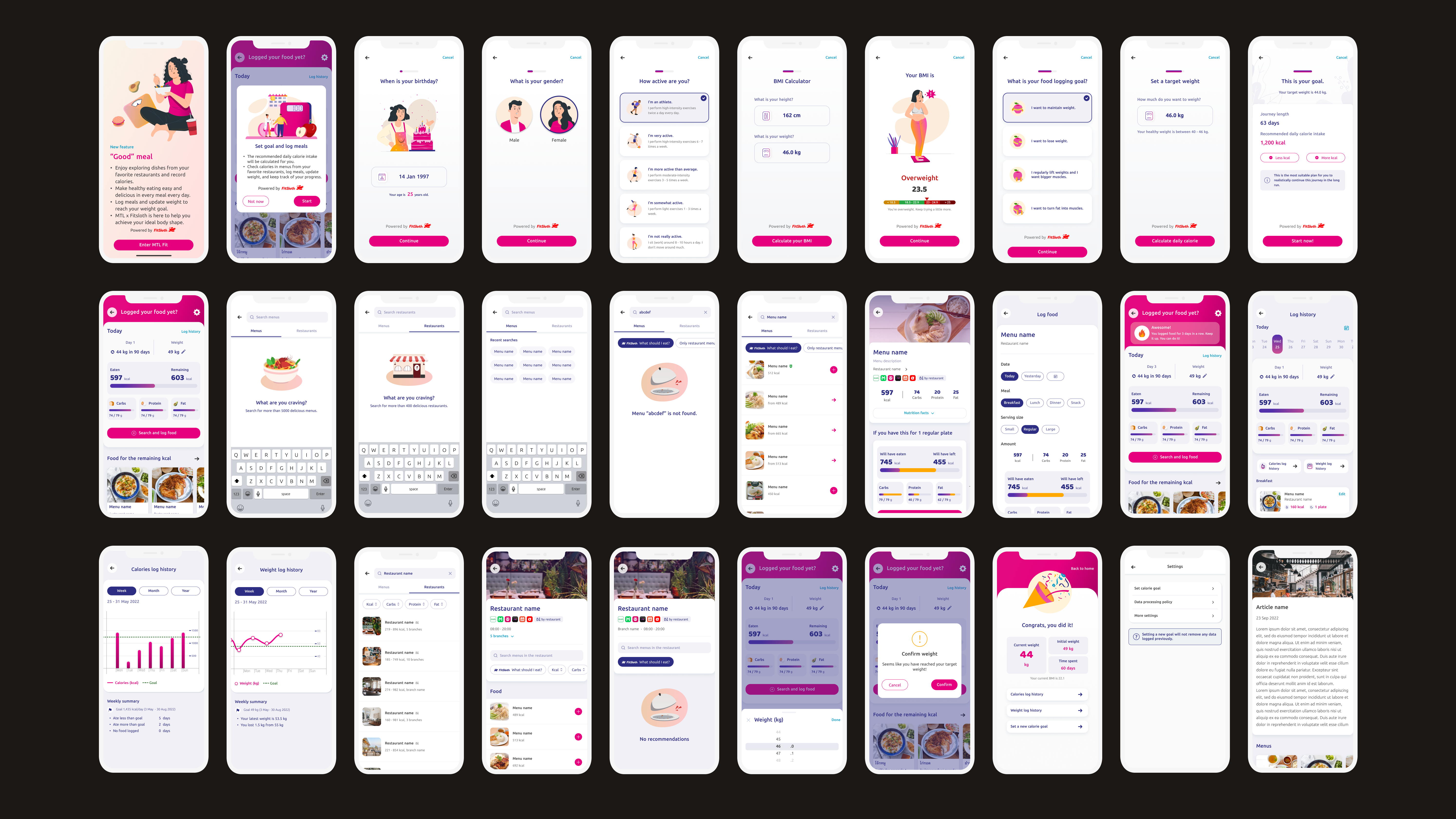
A health app owned by Muang Thai Life Assurance (MTL), one of Thailand's largest insurance companies — striving to promote a holistic and enjoyable healthy lifestyle, guided by the slogan "being healthy is easy and fun."
MTL Fit marked my professional entry into UX/UI design. I joined as the sole designer on the team, owning the end-to-end design across features and later evolving into Lead UX/UI Designer for a comprehensive app redesign — mentoring a junior designer while leading app architecture planning, product roadmap development, and a new design system.
Company
Muang Thai Life Assurance
Role
UX/UI Designer → Lead UX/UI Designer
Timeline
2022–2023
Users
General public & MTL customers
Key features
Nutrition trackingTeam challengesPhoto downloadDynamic pricingBack office toolsApp redesignDesign system
Process
How I approached each feature
1
Understanding objectives and relevant factors
Before designing any feature, I grounded myself in business, user, technical, and legal considerations — ensuring every design decision was purposeful and aligned across teams.
Business objectives
Aligned each feature with quantifiable metrics — new user acquisition, monthly active users, app ratings — while scoping effort and timeline. In high-urgency cases, opted for MVPs to validate quickly before investing further.
User needs & goals
Understood how each feature served users at different stages of their health journey — from beginners to those optimizing their wellbeing. Acted as the voice of the user within the team, using user stories to align stakeholder perspectives with real user needs.
Technical constraints
Collaborated with the development team to understand implementation requirements, effort estimates, and technical opportunities and limitations before committing to a design direction.
Legal considerations
Addressed data privacy and consent requirements relevant to health and insurance data, ensuring designs remained compliant from the outset.
2
Designing a useful, user-friendly, and engaging app
I developed user flows and low-to-mid fidelity wireframes — combined into comprehensive wireflows — then transitioned to high-fidelity mockups and visual design, guided by the following principles:
Utility
Ensured every feature had all elements necessary to meet its objectives — defining all screens, functionalities, and the full user journey.
Usability
Examined the journey from the user's perspective, making each flow as smooth and intuitive as possible.
UX principles
Applied visual hierarchy, familiar UI patterns, and clear primary/secondary CTAs — drawing inspiration from other apps and existing patterns.
Edge cases
Mapped all possible scenarios — loading states, error states — to ensure a seamless experience beyond the happy path.
UX writing
Organised all information to communicate, determined text placement, and crafted language that resonated with users — including English translations.
Visual design
Aimed for pixel-perfect designs following the rule of 8, consistent spacing, and alignment with the existing design system — introducing new elements where needed, with illustrations to add a sense of fun.
3
Testing with users
Usability testing
Conducted moderated remote usability tests once mockups were relatively complete. Started by asking users for initial impressions, then provided task-specific instructions, and in some cases exposed users to different states of the same screen to assess their comprehension.
Constraints
Budget constraints limited testing frequency, so I tested at key milestones when features were nearly polished — allowing users to experience the app as realistically as possible and providing insights that closely resembled real interactions.
Iteration
After each round, I summarised findings and iterated the designs — ensuring features met users' functional and emotional needs before handoff.
4
Assisting the development phase
Handoff
Prepared comprehensive wireflows detailing all aspects of each feature, walked the PM through the full flow, and helped assess development effort. Presented wireflows to the team during bi-weekly sprint grooming sessions.
Support
Maintained open communication with the development team throughout implementation — addressing issues and ensuring designs were integrated seamlessly.
Reflection
Key learnings
What this experience taught me
Taking full design ownership and being the voice of the user in an agile, fast-paced environment
Growing confidence in UI design and UX writing — areas with less prior foundation
Balancing multiple stakeholder needs while maintaining design quality under sprint pressure
Articulating design decisions clearly and engaging in constructive discussions with non-designers
Making design decisions with limited quantitative data — which later drove me to learn SQL and data analysis at Agoda
Leading and mentoring a junior designer while driving strategic design vision for the full app redesign
What I want to do more of
Incorporate quantitative data collection and analysis related to user behaviour into the design process. The absence of this at MTL meant we couldn't take full advantage of learning from real user interactions — a gap I actively addressed when I moved to Agoda, where I set up tracking infrastructure and used SQL to surface design and business insights.
How I turn scattered feedback into a single source of truth
An AI-powered dashboard that transforms thousands of quarterly survey responses from Agoda's accommodation partners into an always-on, real-time source of truth — replacing a manual process that ran only once a year and took the research team two weeks to complete.
Agoda runs a Partner Satisfaction Survey (PSAT) every quarter, completed by roughly 12,000 properties — around 4,000 of whom leave open-text responses. It is a rich, direct signal from accommodation partners about what was and wasn't working. But we had no scalable way to act on it.
1
Manual and infrequent analysis
Processing the open-text responses required the UX Research team to manually read and tag each one — a process that only happened once a year, taking roughly two weeks each time.
2
Partner voice not reaching teams
Because analysis was so infrequent and time-consuming, insights rarely made it to the teams who needed them — leaving three-quarters of feedback per year completely unexamined.
3
Product/feature-centric view only
Even when insights did surface, they were siloed by product or feature team. There was no shared view of which pain-points were systemic across Agoda touchpoints and which were isolated to a specific area.
4
No comparable data for tracking over time
On top of all this, tags evolved year to year as priorities shifted — making it impossible to reliably compare results across cycles. Persistent pain-points could go undetected simply because the taxonomy had changed.
To address this, we set out to:
Standardize a common language on partner pain-points — and use it across teams and time.
Approach
Three steps to standardize, automate, and visualize
We designed a three-step solution in collaboration across Product Design, UX Research, and Data Analytics.
Step 1 — Define a shared taxonomy
We started by looking at previous partner pain-points to identify the most common issues, then grouped them into pre-defined categories — such as Extranet, Payment, Support Quality, and so on. Within each category, we broke them down into specific tags that mapped to features or areas partners interact with.
For each tag, we applied a three-layer definition system to make sure the AI could tag accurately and consistently:
1
General definition
A broad description of what the tag covers.
Example: "Extranet › Property Settings: This refers to when property partners set up property settings and facilities."
2
User action examples
What the partner is actually trying to do.
Example: "Setting check-in/check-out time, configuring facilities, adding payment information."
3
Issue examples
Possible issues or frustrations we anticipate.
Example: "Incorrect property information on Agoda, don't know how to edit information, incorrect breakfast charges."
I collaborated with Supply, Partner Experience, and Product teams to make sure the definitions made sense across the board — resulting in 53 pain-point tags across 7 categories as a shared language for talking about partner pain-points.
Step 2 — Train an AI model to automate tagging
With the standardized tags and definitions in place, we needed a way to automatically tag thousands of partner responses. Our data analyst trained the AI model using the three-layer definitions. Responses were auto-translated where needed, then tagged with the category, the tag chosen, and the reason behind it.
I then reviewed the output to check tagging accuracy. If something was off, we went back to revise the definitions and ran the model again. After a few rounds of this, accuracy reached around 95%. From there, a data pipeline was built so that when new PSAT responses come in each quarter, the AI reads each open-text response and tags it automatically — consistently, without manual effort.
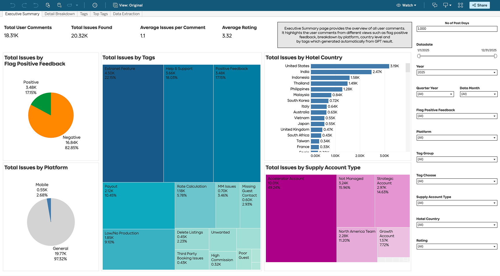
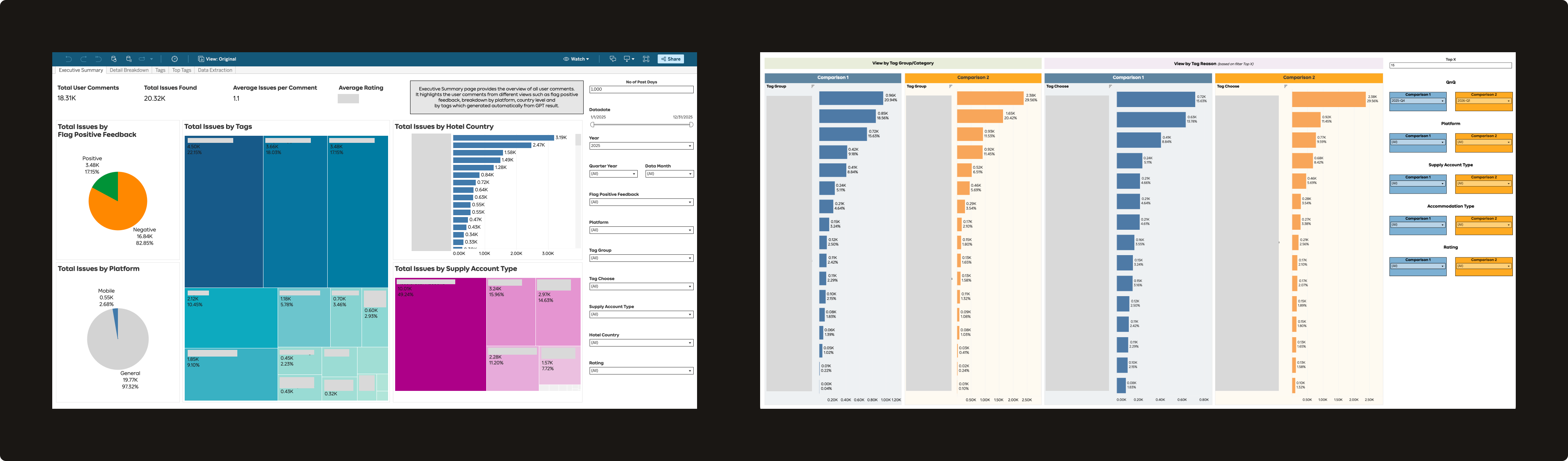
Step 3 — Build a dashboard as a single source of truth
With automated tagging in place, we needed a way for everyone to access and explore this data. I designed the PSAT Dashboard on Tableau, which has three main views:
1
Overview
The landing page — showing total user comments and issues found, average partner rating, positive vs. negative feedback ratio, and a percentage breakdown of issues by category and tag.
2
Top Tags
A ranked view of the most frequent pain-points, helping teams quickly see which issues account for the highest share of partner complaints. Filterable by time period, market, supply account type, and property type — useful for segment analysis, localisation work, or tracking changes over time.
3
Deep Dive
Drill down to see exact partner comments per tag. If you're working on a specific feature, you can go straight to the relevant tag and read the actual verbatims.
Impact
From a two-week manual exercise to an always-on system
Q4 2024
Dashboard launched
2,239
Average monthly views
53 tags
Standardized pain-point taxonomy
Widely adopted
Across Supply, Product, Design, UX Research, Partner Experience, and business teams
Use case 1 — Agoda Partner Portal State of the Union
The dashboard made it easy for any team to look at partner pain-points longitudinally — tracking which issues had improved, which had worsened, and what was driving the changes. For example, 2025 data showed a notable drop in complaints around promotions and performance (linked directly to Supply Discount scrum work and page load improvements across Property Portal scrums), while finance-related complaints rose to become the top issue at 16%.
Teams across the organization now reference this data regularly — from product discovery, prioritization, and roadmap planning to end-of-quarter reviews.
Use case 2 — Deep-diving into a specific feature
Anyone can filter by a specific tag — say, "Guest Messages" — to see what percentage of total partner complaints it accounts for, then download the verbatims and run their own GPT analysis to build hypotheses. This is now a standard step in the discovery phase for several product teams, replacing or supplementing what used to require a dedicated UX Research engagement.
Example prompt used by teams: "Analyse these verbatims and tell me the top 5 categories of user pain-points, what each means, the % for each, and 2–3 verbatim examples per category."
From the Guest Messages analysis: 34% of complaints were about messaging restrictions (links, phone numbers, and PDFs blocked), and 26% were about delivery and notification failures.
Use case 3 — Pre/post experiment validation
Teams running A/B experiments can now cross-reference PSAT data to validate whether a design change affected partner sentiment — not just the primary metric. In one example, an experiment on deactivating promotions showed that the B-side (with the new deactivation flow) had fewer promo-related complaints (2% vs 4%) and a higher PSAT score (3.41 vs 3.07), directionally supporting the design decision.
The sample size is limited to survey respondents during the experiment window, so results are used directionally — but this adds a qualitative signal layer that wasn't previously available at all.
What's next
The system keeps growing
This project was different from most of my product design work. I wasn't just solving a specific partner-facing UX problem — I was building internal infrastructure that made it possible for others to solve partner problems faster and with better evidence. What started as a Supply Design initiative is now a shared system used across the organization.
Going deeper, going wider, bigger uses
With the dashboard now used across teams, the next step is expanding the taxonomy further — more granular tagging within existing categories, broader coverage across new ones, and exploring how to identify and surface unknown pain-points that fall outside the current taxonomy.
Going beyond the dashboard
Rather than expecting stakeholders to visit the dashboard, we're exploring whether there's a better way to bring insights to them. With more AI capabilities, one direction is proactively sending teams an AI-generated summary of the pain-points most relevant to their product area — delivered directly, without needing to look it up.
Over the last few months I've built AI into an end-to-end design process — from research and context-gathering through prototyping, evaluation, and handoff. Here's what that looks like in practice, most recently across Analytics Center's two parallel product milestones — Market Demand and Margin Program reporting.
Timeline
Ongoing
Team
2 scrums with 2 product managers
My role
Sole designer, both product milestonesAI-assisted prototypingCross-functional facilitation
Approach
AI across design projects
Research & context
1
Context gathering
Pull domain knowledge and business context from internal resources. Example: Agoda business context, partner program eligibility rules.
2
Competitive research
Analyze competitor products, patterns, and positioning. Example: reviewed airline, OTA, and metasearch landing pages to see what each was selling, to help shape direction for a Flights "flagship store" concept.
3
Research synthesis
Synthesize past research into key findings to inform design decisions. Example: Analytics Center and Margin Program performance — past research consolidated into key findings that fed directly into a structured, decision-tracking spec.
4
Data query
Write queries to pull historical quantitative data. Example: partner program churn behavior — querying deactivation patterns by hotel segment, booking volume, and time in program.
Build
5
Design exploration & prototyping
Brainstorm UX/UI concepts and build real, interactive prototypes. Example: Analytics, partner programs, and Flights flagship store.
6
Copywriting
Tighten and refine English copy.
7
GitLab setup
Create projects and push prototypes to GitLab so multiple teams — product, dev, business, and other designers — can click through them directly.
Communicate & handoff
8
Meeting synthesis
Turn meeting discussions into actionable next steps. Example: Margin Program design syncs — transcripts turned into action items and a running decisions log the same day.
9
Bridging prototype to engineering handoff
Map a prototype's components and states to a structured spec engineers can build from.
Meta
10
AI literacy
Use AI to learn how to work with AI more effectively.
AI in practice
Two product milestones, one Analytics Center
Agoda Partner Portal's Analytics Center scope split into two revamps of existing pages that kicked off in parallel — Market Demand reporting and Margin Program performance reporting — each with a different PM, scrum, and weekly sync cadence. I was the only designer across both.
Setting up a project and contexts in Cursor
The groundwork started months before Market Demand and Margin Program became Q3 2026 product milestones — I'd already run UX audits on the current designs, helped with user research, conducted competitor analyses, and sat in on early discussions with product, market managers, business, and other designers about what to improve. My old process would've been gathering all of that manually into a Figma moodboard. This time I wanted AI in from the start: I set up a single Cursor project so everything could live in one place, then used MCP to pull in what I already had — competitor analysis, user research, market manager insights — and distilled it into a single markdown context file, so the rest of the process — starting with design exploration — stemmed from one consistent source of truth.
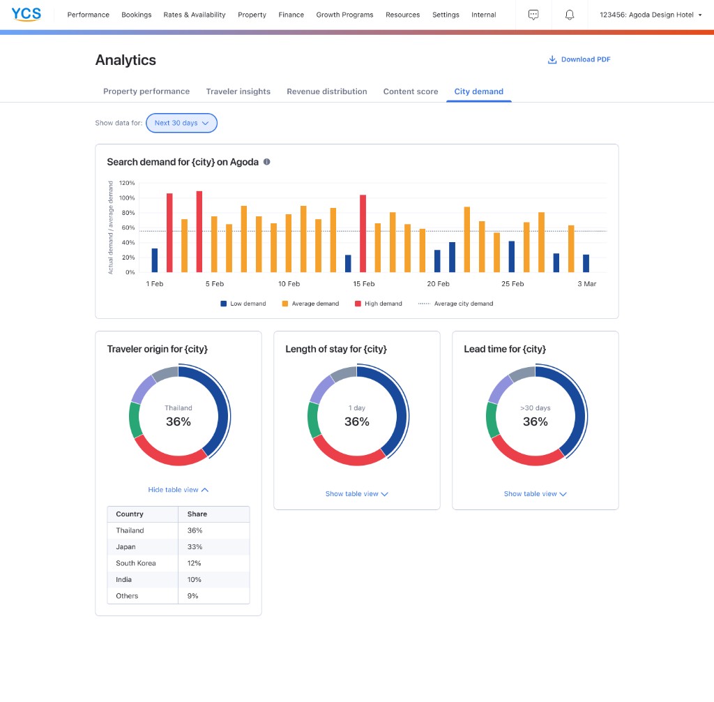
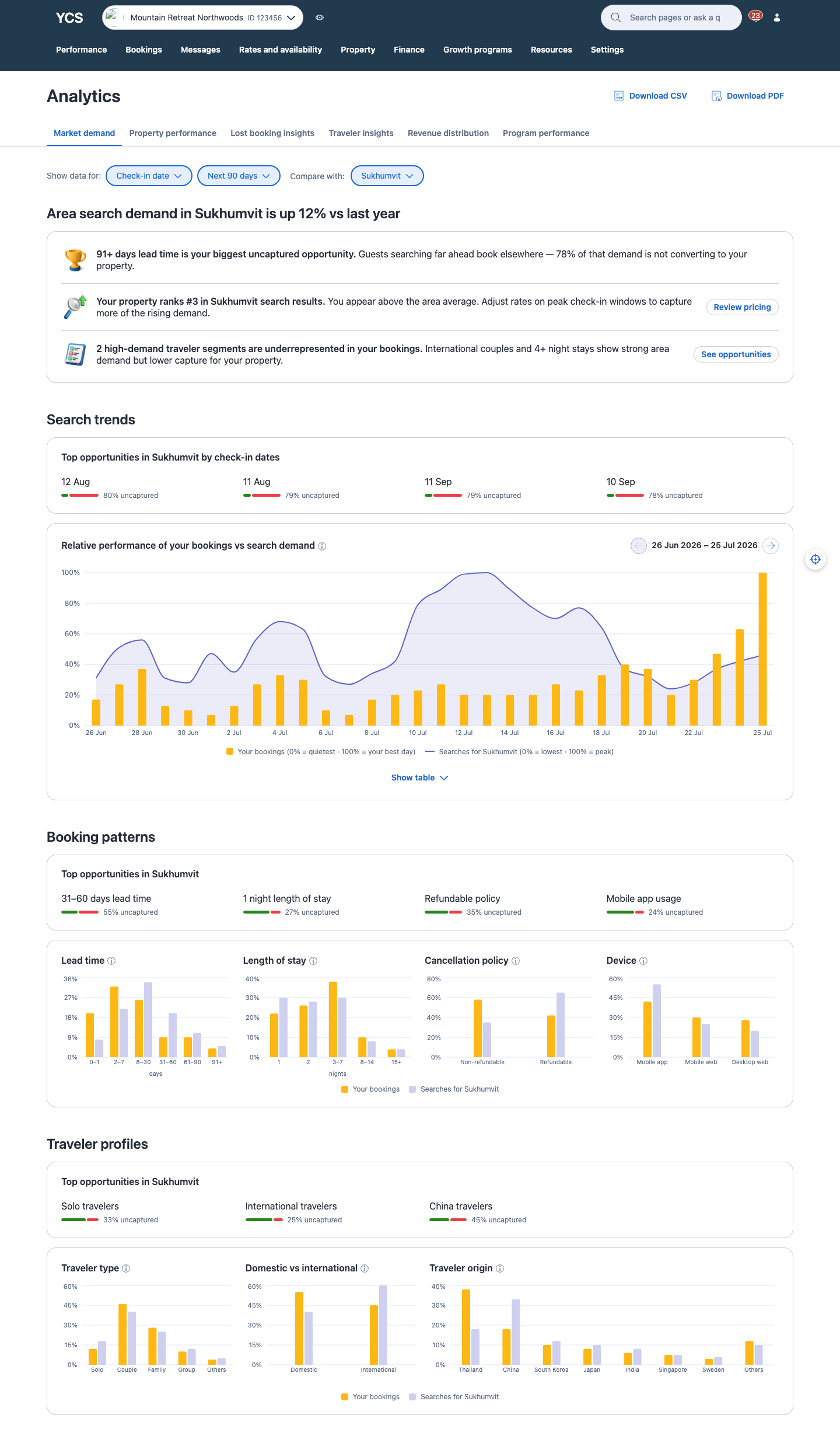
Market demand
Before
Partner need
Spot uncaptured demand & pricing opportunity
A few pain points
Lacks forward-looking demand data
No visibility into demand being missed
No clear next action
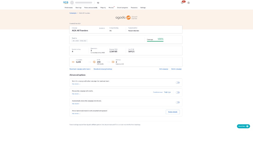
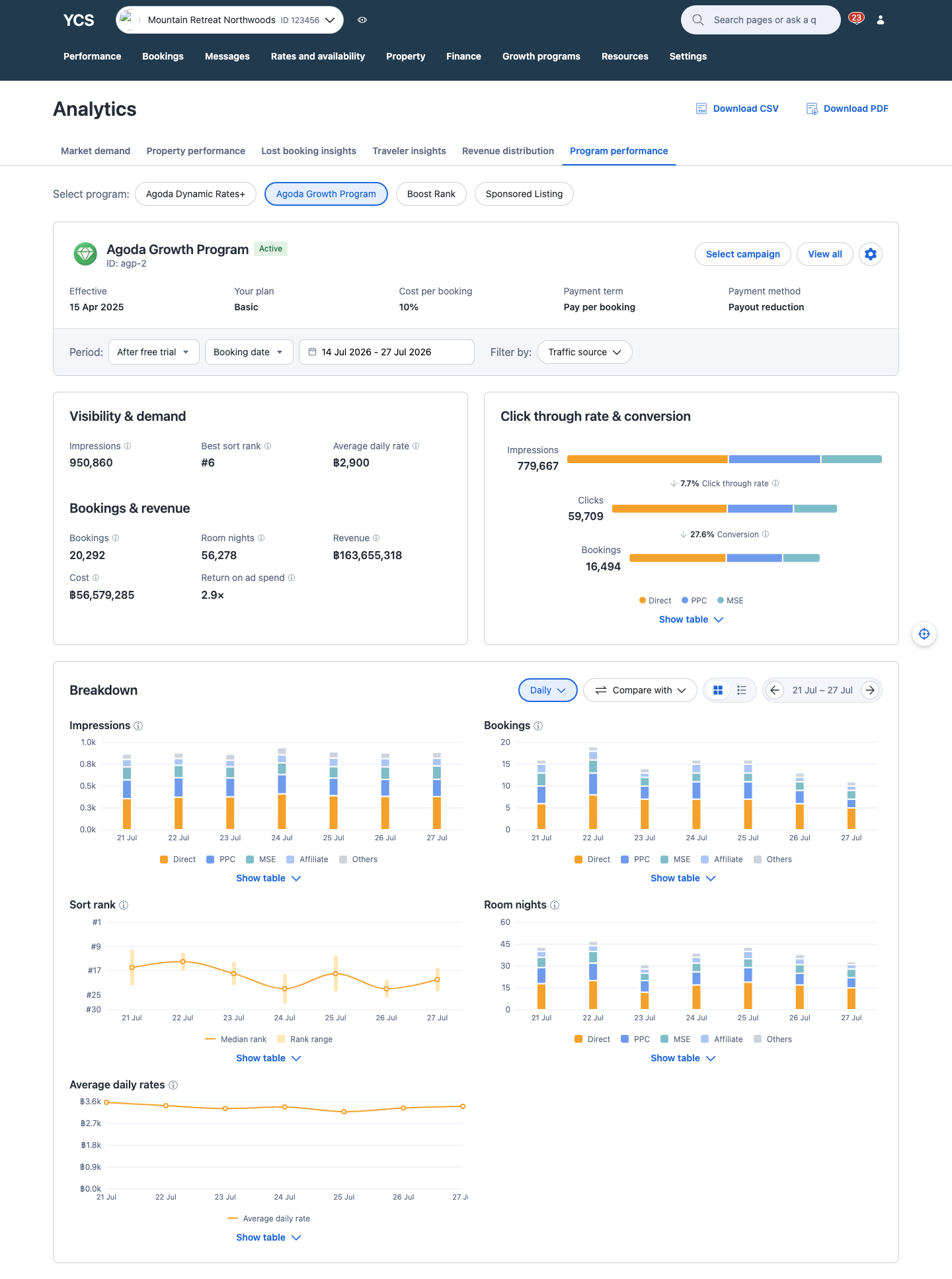
Margin program performance
Before
Partner need
Understand program performance & bookings across Agoda's flagship partner programs — AGP, Boost Rank, Sponsored Listing, ADR+
A few pain points
Raw counts only — impressions, clicks, bookings, revenue
No before/after comparison
ROAS calculated incorrectly
Design exploration & prototyping
With context in place, I connected Agoda's design system and Recharts inside Cursor and built a shared skeleton first, then split into sandboxes within the same prototype — one per product milestone. Each sandbox became a playground for exploration: I'd prompt AI for ideas, then guide and refine with my own take until one held up. Once a sandbox looked right, I asked AI to piece the components together into the working prototype.
Market demand sandbox
One of several explored here: how to visually flag the demand a hotel is missing out on. I went back and forth with AI through several rounds — colors, shapes, typography — before landing on the version on the right: the green-to-red ratio shows captured vs. uncaptured at a glance, and the gap between the two segments (instead of a connected bar) makes them easier to tell apart.
Top opportunities in Zürich
31–60 days lead time
55% uncaptured
1 night length of stay
27% uncaptured
Top opportunities in Zürich
31–60 days lead time
55% uncaptured
1 night length of stay
27% uncaptured
Selected
Top opportunities in Zürich
31–60 days lead time
55% uncaptured
1 night length of stay
27% uncaptured
Margin program sandbox
Another sandbox thread: charting median sort rank over time. AI built out a handful of approaches — a plain trend line, a benchmark zone, a target threshold — but a single point per day was hiding something a partner would actually want to know: how much their rank swings day to day, not just where it lands on average. The version on the right, daily columns spanning each day's best-to-worst rank, answered that directly.
Selected
Syncs & interactions
I published the prototype to GitLab Pages so PM, business, and BI could try it out themselves. Syncs then focused on which directions were worth building for partners, and what BI could support. After each sync, an AI skill I built converted the transcript into a same-day action-item list and rolled it into one Confluence doc organized by partner jobs-to-be-done — decided, pending design, pending BI — so I could jump straight into the next iteration. It took a few rounds to reach agreement.
Program Performance Reporting
Partner jobs to be done
Understand which campaign I'm looking at
Decided
Campaign context card shows dates, cost/booking, and targeting so partners can tell duplicate-named campaigns apart
Pending design
Free-trial toggle — switch free-trial vs. post–free-trial results on the same report, no separate campaign ID hunt
Pending BI
Can free-trial and paid-period data be linked so the toggle can pull both from one campaign record?
Understand how the program is performing
Decided
Key metrics: bookings & room nights, revenue, cost, and ROAS — shown as a flat multiplier (e.g. 2.8×), not a percentage
Pending design
Negative uplift messaging — how to show and explain underperformance without discouraging partners
Pending BI
Which metrics get a pre/post uplift %, and is that comparison still meaningful for long-running campaigns?
Working prototypes
Both prototypes are close to final — the last steps are locking the remaining UI details and preparing the engineering handoff.
Market demand
Program performance
Reflection
On working with AI this way
This project is a small slice of what AI can do for design — a sandbox, a decision log, a working prototype. AI's role in my process is only going to grow from here, and I'm excited to keep figuring out what that looks like as the tools improve.